I researched some contemporary female artists, who have rather natural images, such as Miley Cyrus, Hilary Duff, Ashley Simpson, Beyonce, Rhianna. It was harder for me to find a female rock artist similar to Ellen because the rock industry consists mostly of males. The only female artists that would really relate to Ellen's style of music would be Amy Lee from Evanescene or Avril Lavigne and Debbie Harry.
Here are few examples of the album covers I looked at:
Beyonce:
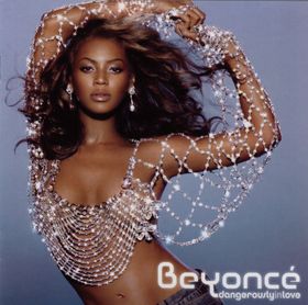 This cover really stood out to me because it's simple but elegant at the same time, I like how the background is a very calm blue reflecting her personality and giving off a relaxed but energetic feeling. I though this could be a possible choice to use as an influence for my album cover because the way Beyonce is positioned, and the clothing she is wearing really conveys what type of artist she is towards the audience re-enforcing her R&B image from the diamond top and low rise jeans, whilst still appearing classy, sexy and sophisticated. I also think the use of text is appealing because it's not too busy and tells the audience exactly what they need to know.
Miley Cyrus:
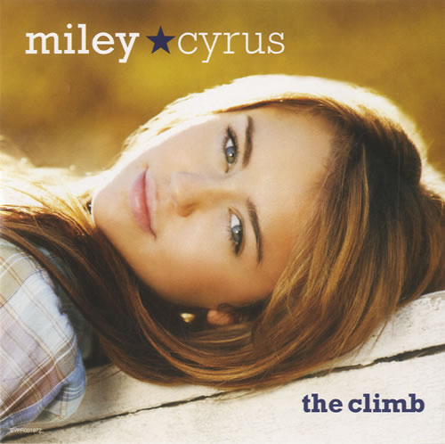 This album cover has a very natural and earthy feeling to it from the yellowish tint. I like how this image is captured at a sideways angle because it creates a laid back and easy going atmosphere. Miley looks fresh, lively, and pure which is the image I think is being portrayed when looking at this. Again like beyonces album, the use of text catches my eye because it's simple and get straight to the point, the use of colour white and blue creates a sort of tomboy, active sensation because its a masculine colour, giving her innocent image a bit of an edge.
Amy Lee:
 This cover is very edgey, it portrays the intensity and darkness of the singers image and possibably the content of songs. I like how it really gives of the right vibe to what kind of music Evanesance is producing. The use of balck and blue, whilst having a very contrasted effect give it a harsher and boldness, showing they are confident and like to make a big impression.Debbie Harry:
 This blondie cover focuses on the use of pattern and colour, creating a very busy and engergetic feeling. I like how she is very poised, creating a sense of strength and ambition. The font creates a more rock image because its bold and the pink and blues show feminine but masculine qualitys. Overall I believe that this conveys the image of a fierce rock chick.
here are the before and after shots of my own images:
Album Cover

 I thought that a portrait shot would be ideal for the album cover because it focuses on the face of the artist and gives a more personal and emotional atmosphere. The back and white effect creates a softer appeal to the image on a whole however the darker black around the eyes and the pinkness of the lips gives it more edge. I wanted to keep it simple because Ellen is really natural, which is the image she wants to portray with the audience whilst having rock qualitys.
 Website
I decided to go for the traditional myspace webpage. Most rising solo arists/bands create myspaces to promote their music and get their name noticed by potential record labels. I've gotten ideas from other solo artists such as a male artist called Jimmy Robbins.
I like the professional feel to his page whilst still appealing to a younger audience by the use of font and colours. Hes also got alot of infomation about upcoming tours, new songs, and a biography which help the fans get a better insight to all they want to know.
Digipak
We were told to create a dvd digipack for part of our task, I looked at various examples such as one from a Bridget Jones dvd and the Work of Dicrector Michel Gondry.
The Bridget Jones one was fairly simple a four page spread, with the front cover featuring the ablum in a dvd sized format, a track listing and breif biography of the band on the inside DPS, and a backcover including a picture and all the rights and copyright laws.
The Director's one was much larger and contained the backstory and a more in depth history of the director from his point of view and the 3rd person.
I decided to go along the lines of the Bridget Jones digipack because it fitted in better with my project as a whole and I have produced some quality pictures that would work with the format. I decided to use the Album frontcover as the front cover of the pack, a DPS consisting of a breif summary of Ellen Smithson from the 3rd person and a magazine style quotation page from Ellen's point of view, and a back cover containing the rights and copyright.


WEBSITE: